Revolutionizing Wellness with a $1.5B+ Glucose-Monitoring App Design
The Context and Impact
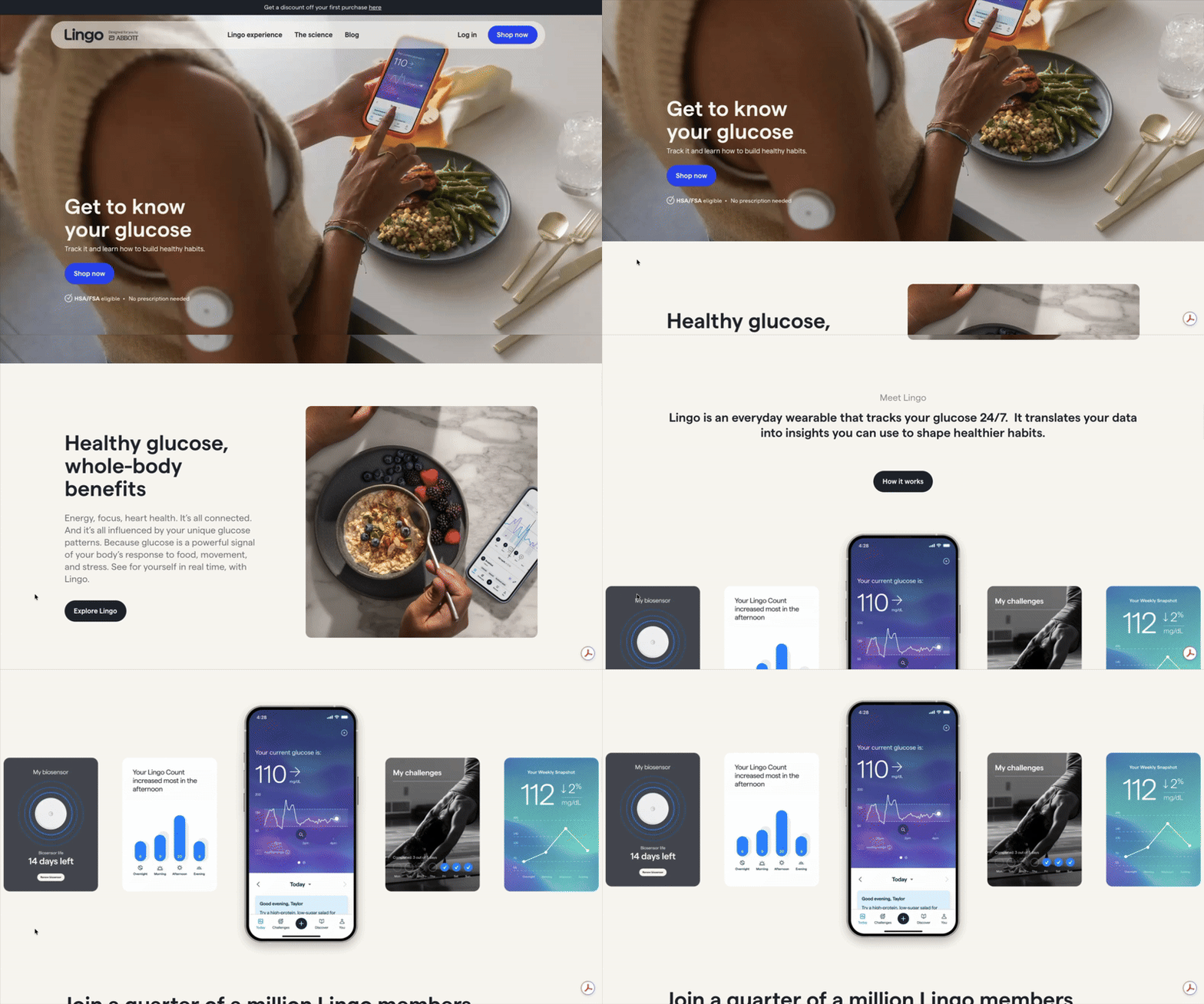
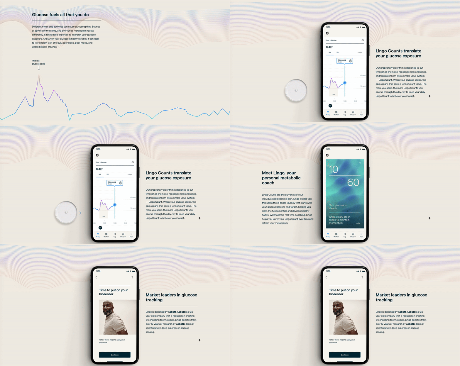
This was McKinsey’s largest global business build of 2023. We partnered with a major MedTech company to help build their first consumer wearable product that translates data from a physical continuous glucose monitor (CGM) to an app. They were traditionally a B2B company and needed help to shift to becoming a B2C company.
The project opened up a $1.5B+ market, creating 200 jobs, 500+ customer touchpoints through the end-to-end delivery of 3 products: a direct-to-consumer website to market the app, the app, and a go-to-market strategy.
My Role
I led the app design team of 5 designers, 2 product owners, and 20 engineers. We built the native app, e-commerce website and scalable design system from scratch over the course of 8 months, taking the product from 0 to 1.
I worked with the CEO to define the future-state vision for the product and translated the vision into a product strategy and workplan for my team. I structured the workplan into 2 chunks:
i) Discovery - where we conducted qualitative interviews and quantitative user research to understand user motivations and jobs-to-be-done
ii) Development - where we worked in an agile cadence to design low to high fidelity wireframes. User testing, feedback and design QA were baked into 2 week development sprints.
We designed for 200+ edge cases, across 300+ screens and worked closely with developers to build, QA and launch the product in 2 large European markets with a fast-follow in the US. Additionally, I led a future-state visioning workshop with C-Suite executives to define the next stage of the product.
The App
This project was extremely complex due to 3 key reasons:
i) A highly regulated environment: given that the CGM is a medical device, the app and website were subjected to heavy FDA regulations which created additional constraints on the designs
ii) A multifaceted (and often, fragmented) stakeholder ecosystem: the clients had brought together a myriad of third-party and in-house teams (regulatory, science, brand, UX, and engineering) to work on this product which made cross-team collaboration particularly challenging
iii) Competing (and sometimes, conflicting) priorities of each team: while the design team was solving for seamless UX, the engineering team was solving for build feasibility, and the science team was solving for precise representation of glucose science
I led my team to advocate for strong UX without compromising on the clarity of the science, distinctiveness of the brand while ensuring the tech feasibility of the build. I translated research into quick prototypes to test and learn with users per sprint. I took a native-first data visualization approach to achieve simple sophistication and documented 200+ edge cases to ensure holistic documentation handoff to our engineering teams.
The Website and Scalable Design System
In addition to the app, I supported the design of an e-commerce site for the marketing and sale of the app. We worked closely with the go-to-market teams to define the pricing and subscription model and tested the “customer voice” with users. What we found was that users wanted to i) be assured that the actual installing of the CGM on their arms would be pain-free, ii) understand the health implications of monitoring their glucose and iii) receive coaching and advice to improve their overall lifestyles. We tailored the messaging on the e-commerce site to cater to the needs of our users.
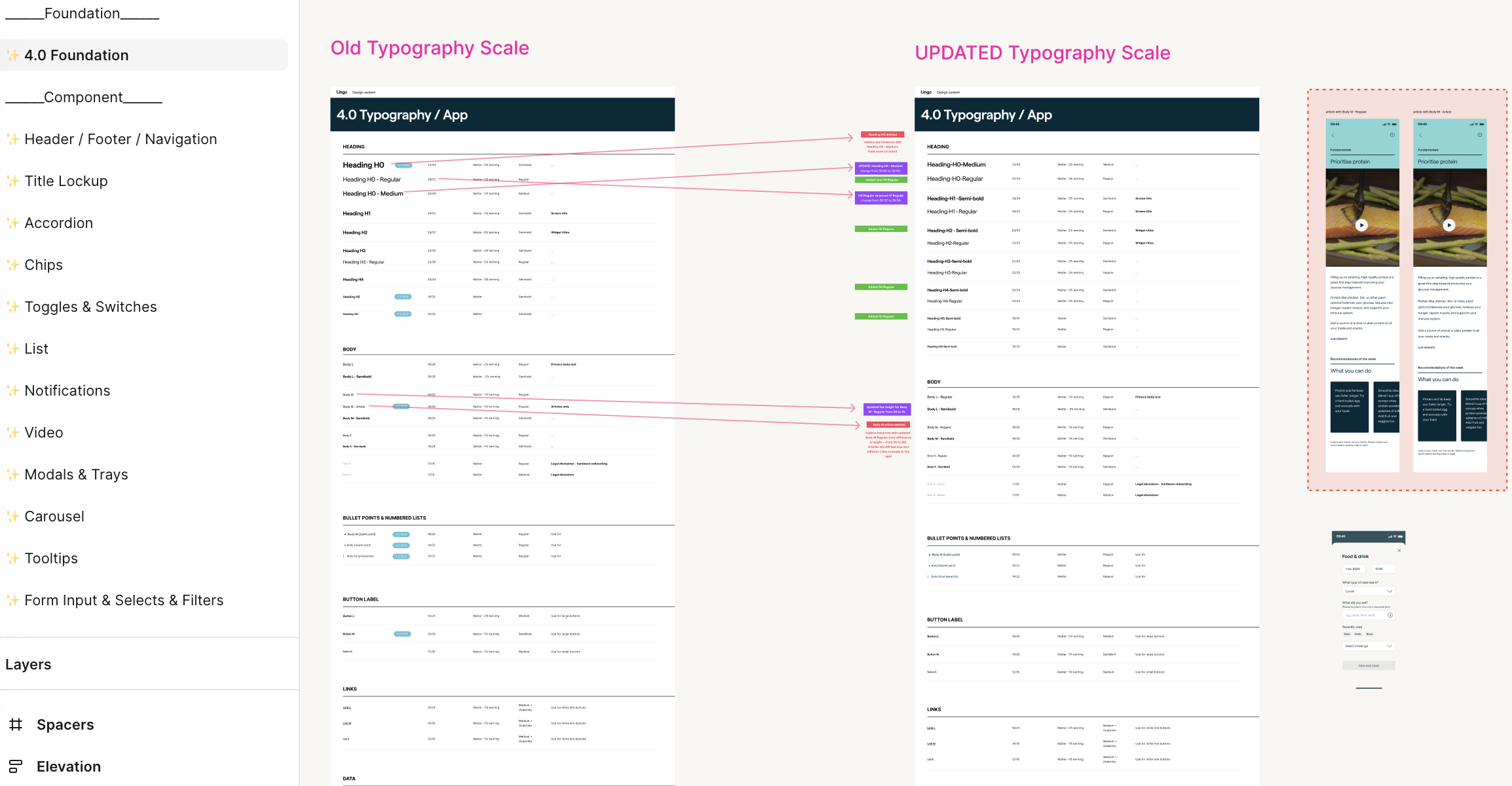
I built a scalable and responsive design system from scratch to work across native app, a mobile-responsive website and our physical product and marketing materials.
The Process and Research
All good design requires an iterative feedback process. I worked in 2-week sprints where user testing, refinement and design QA were baked into the process. In addition to the standard agile ceremonies, we had 2x weekly jams across the complex stakeholder groups: design x engineering x science teams. I worked closely with the engineering teams to ensure a smooth design to dev hand-off.
Reflections
Communicate and over-communicate: With a diverse team of skillsets (brand, design, engineering, science, regulatory) and competing priorities, it’s easy to run into conflicts. Over-communicating helps provide transparency to other teams and reminds us that we’re all working towards the same goal - product launch!
Agile ceremonies can be at odds with regulatory constraints: Given the app was regulated by the FDA, we had to submit each screen and interaction design to the FDA. Figma and similar tools, however, are built for continuous iteration which made timestamped submissions difficult. To that end, we had to resort to PDFs to manually document our Figma designs
Behavioral design is powerful and can have unintended consequences: Designing a fitness app that transforms users’ behaviors is good insofar as it helps people live better, fuller lives. However, like all technology, the app can also be misused e.g., leads to unhealthy relationship with food. To prevent any unintended consequences, we worked closely with the science team to ensure that the messaging of the app incentivized healthy life habits


