Reinventing the UX of Unemployment Assistance in a Major US State
The Context
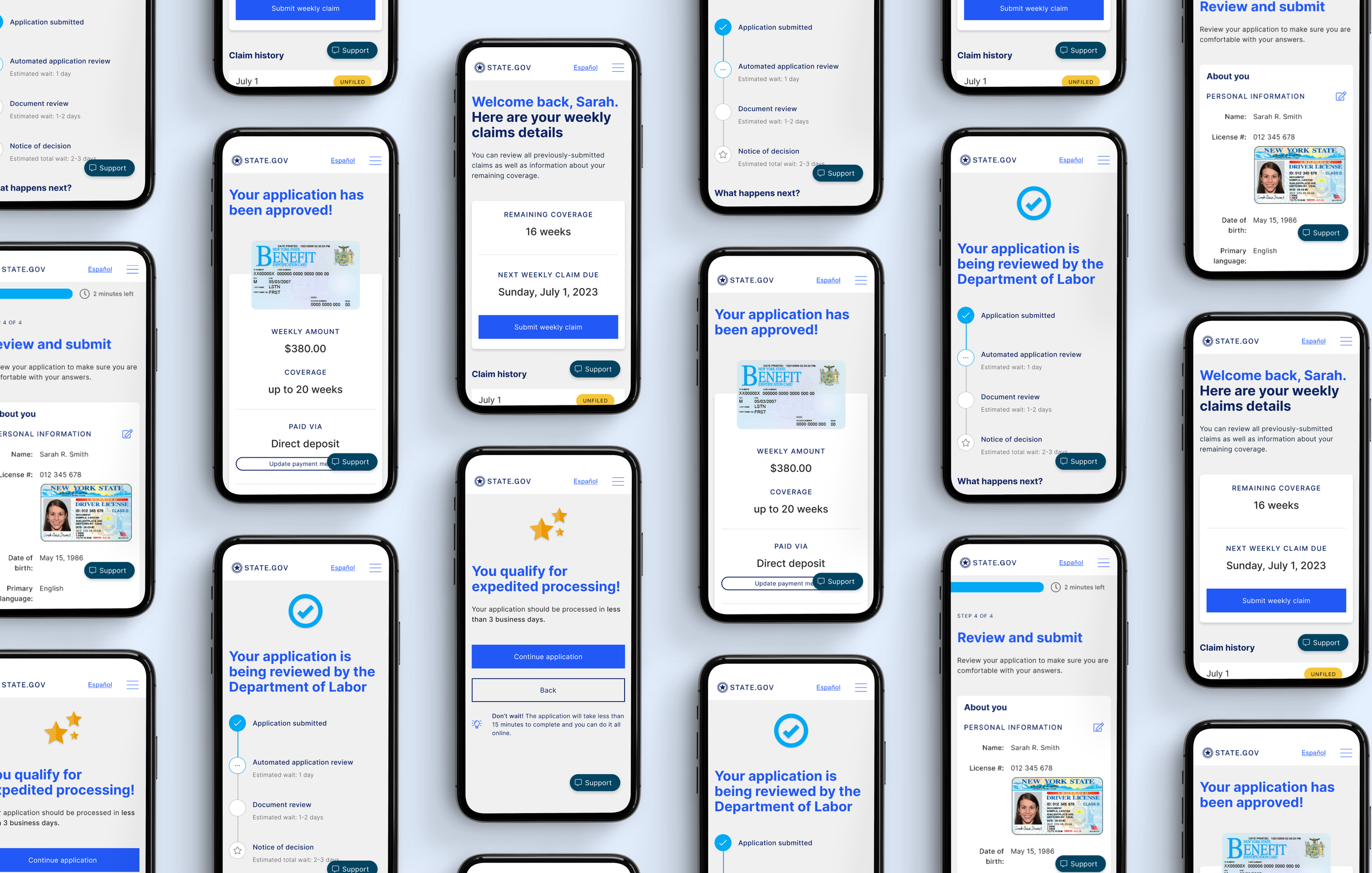
During the height of the pandemic, we partnered with a large US state government to redesign the unemployment and re-employment experiences for claimants of unemployment benefits, job seekers, and employers. Many of the folks requesting for assistance were non-native speakers and non-tech-savvy and thus struggled to navigate the complicated application forms of a legacy government website to get assistance during some of their most desperate times of need. The source of the problem was two-fold:
i) The government agency had been built upon decades of legacy front and back-end technology and needed to modernize during Covid to rapidly respond to the 5x increase in need for unemployment assistance
ii) Given the legacy technologies, the government has been building band-aid UX solutions when what they needed was a major overhaul of their service design and systems and processes
My Role
To that end, our goal was to conduct a service redesign of the claimant experience. I led my team to conduct qualitative and quantitative research to better understand how claimants currently access assistance in order to propose a future state experience that would better cater to their needs. Our solution included 3 parts:
i) Website re-design: I led my team to redesign the FAQ and resources pages of the agency’s website as what we found was that claimants needed a simple step-by-step guide to claiming their benefits
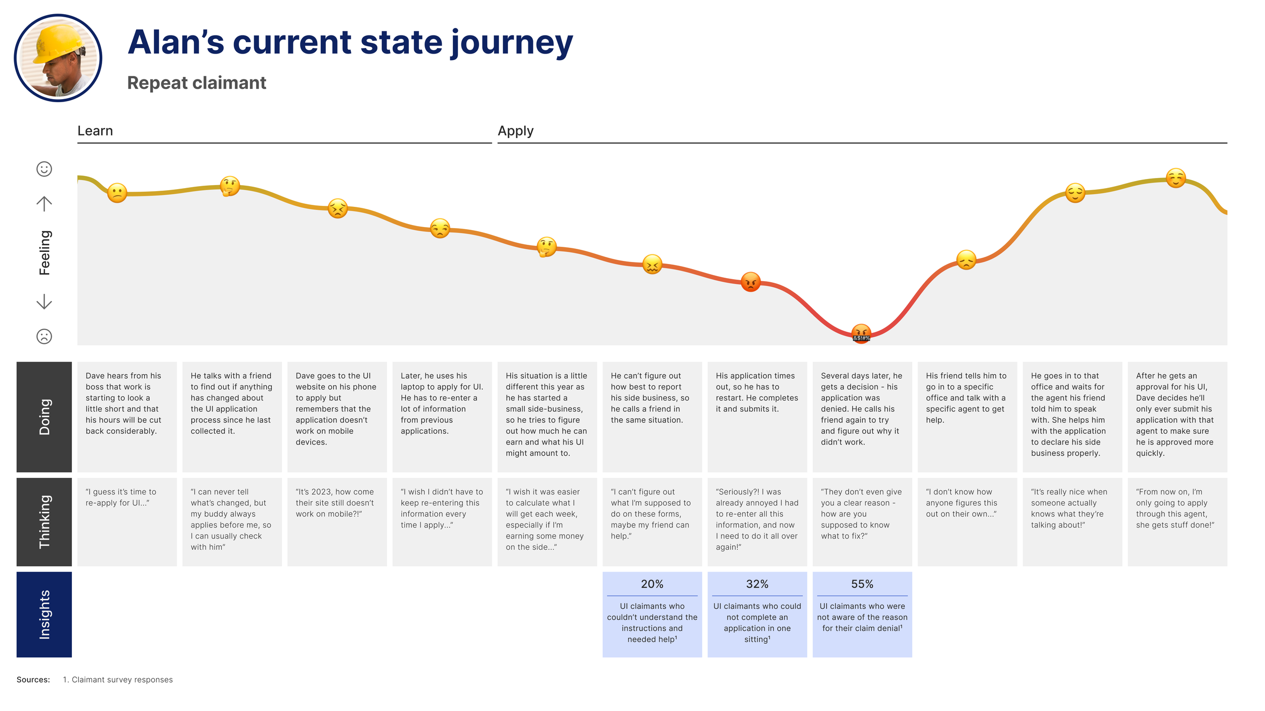
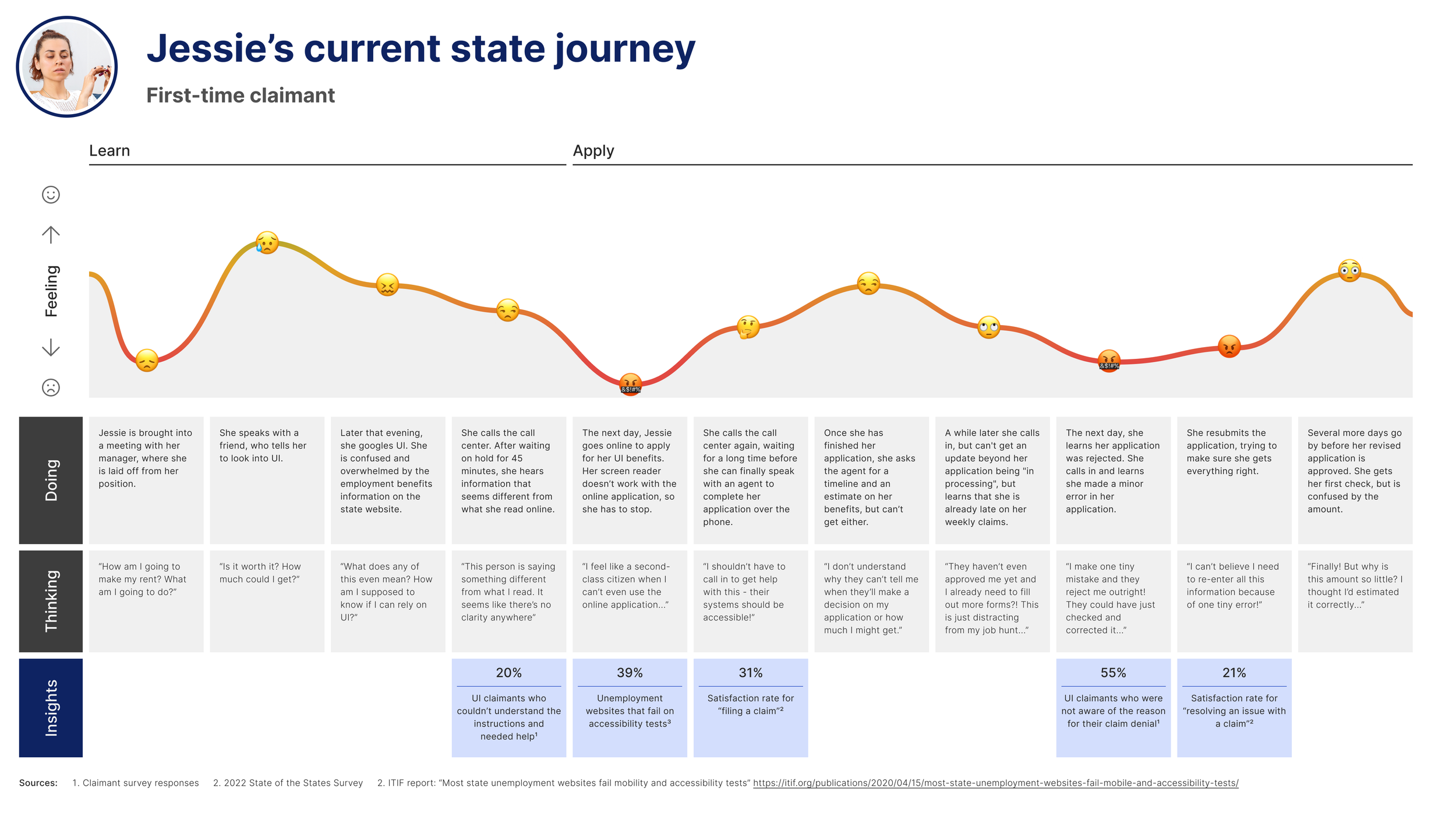
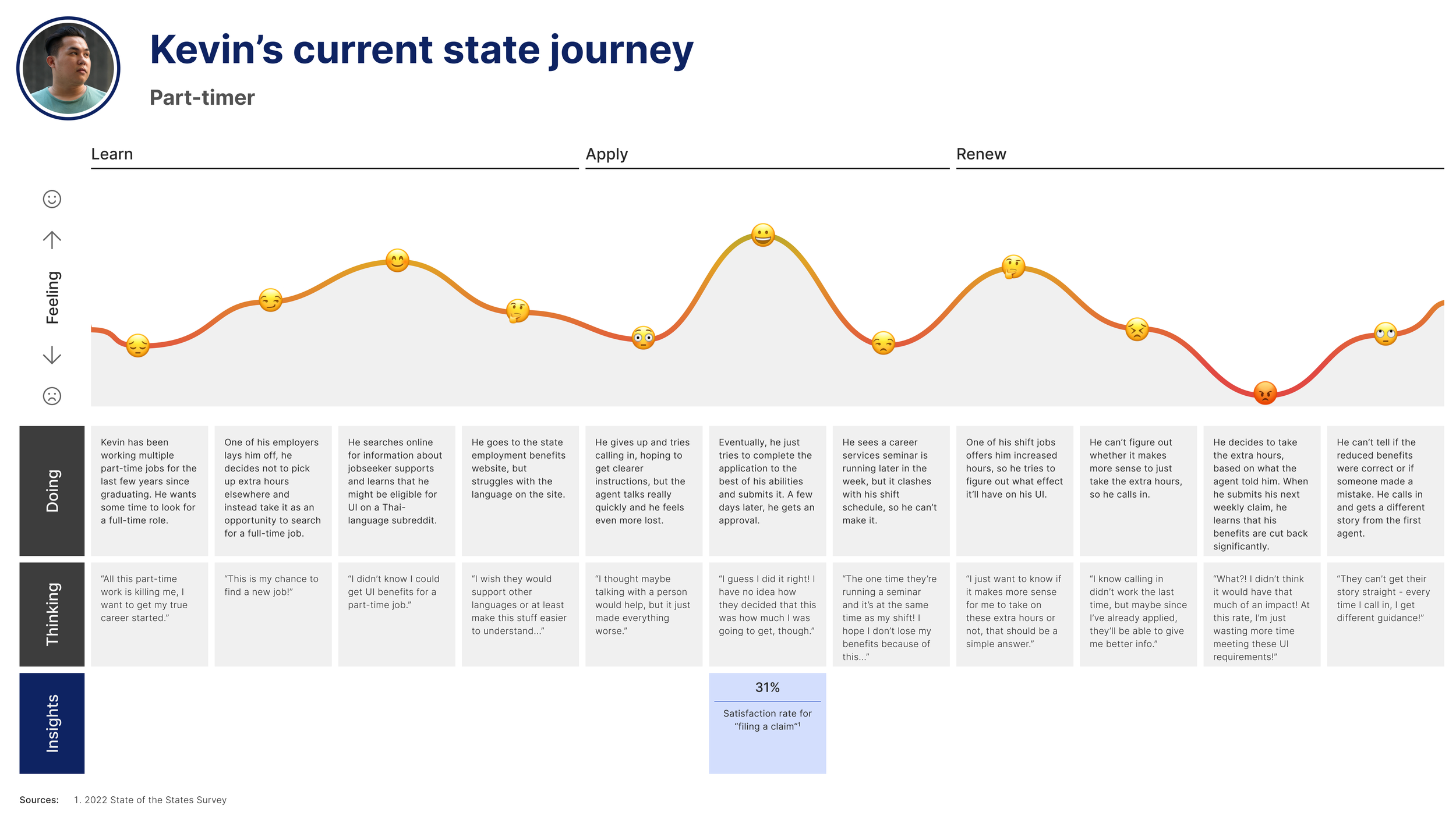
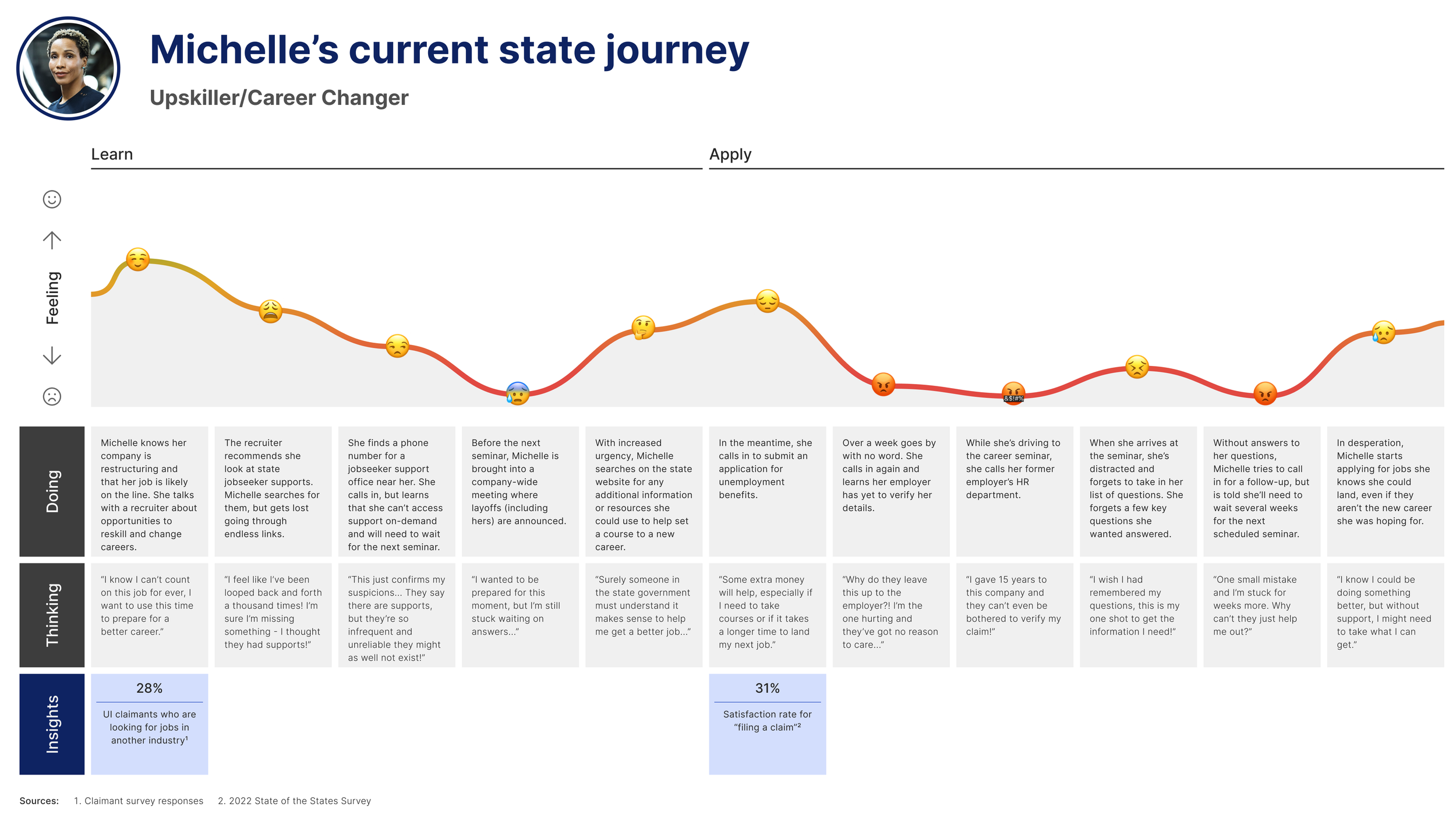
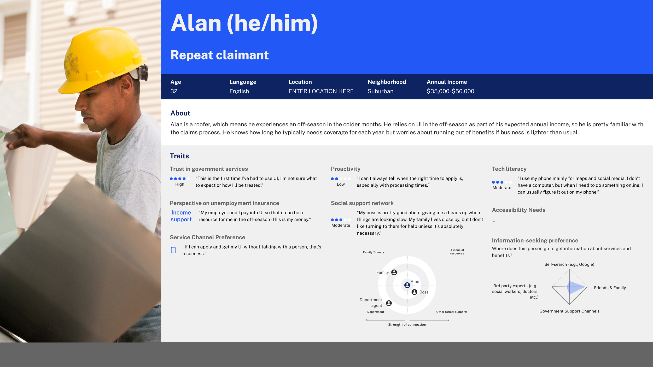
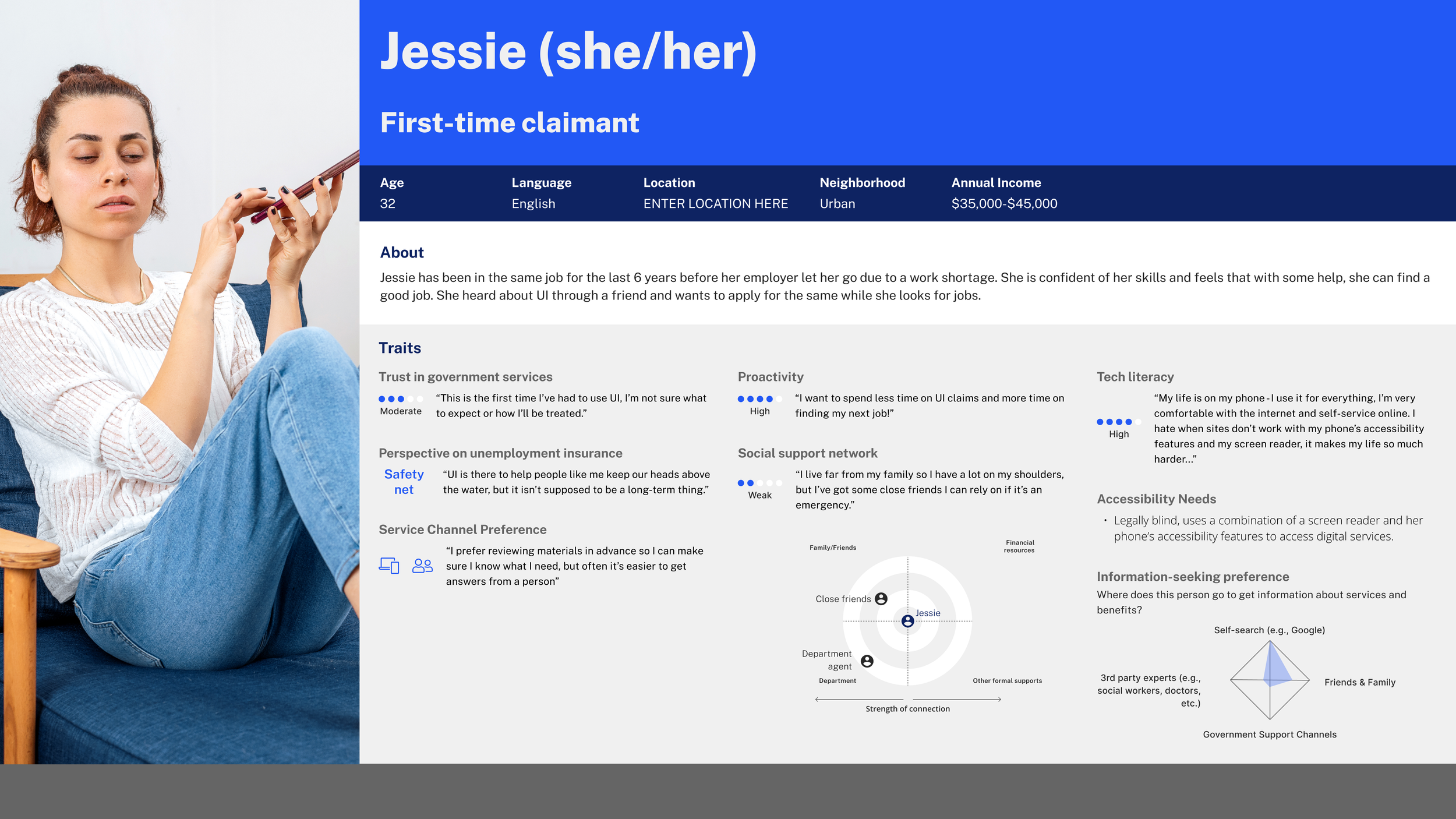
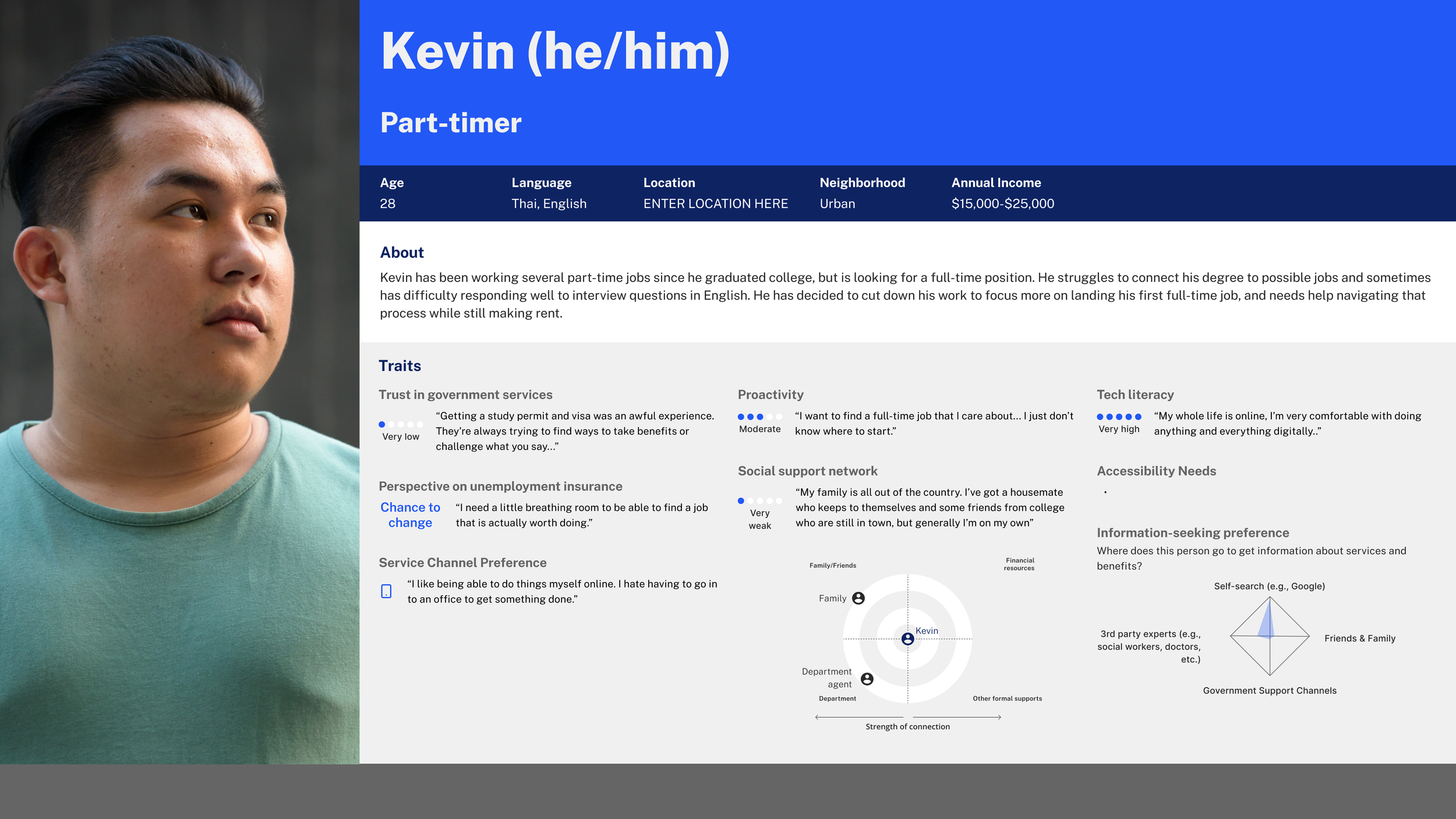
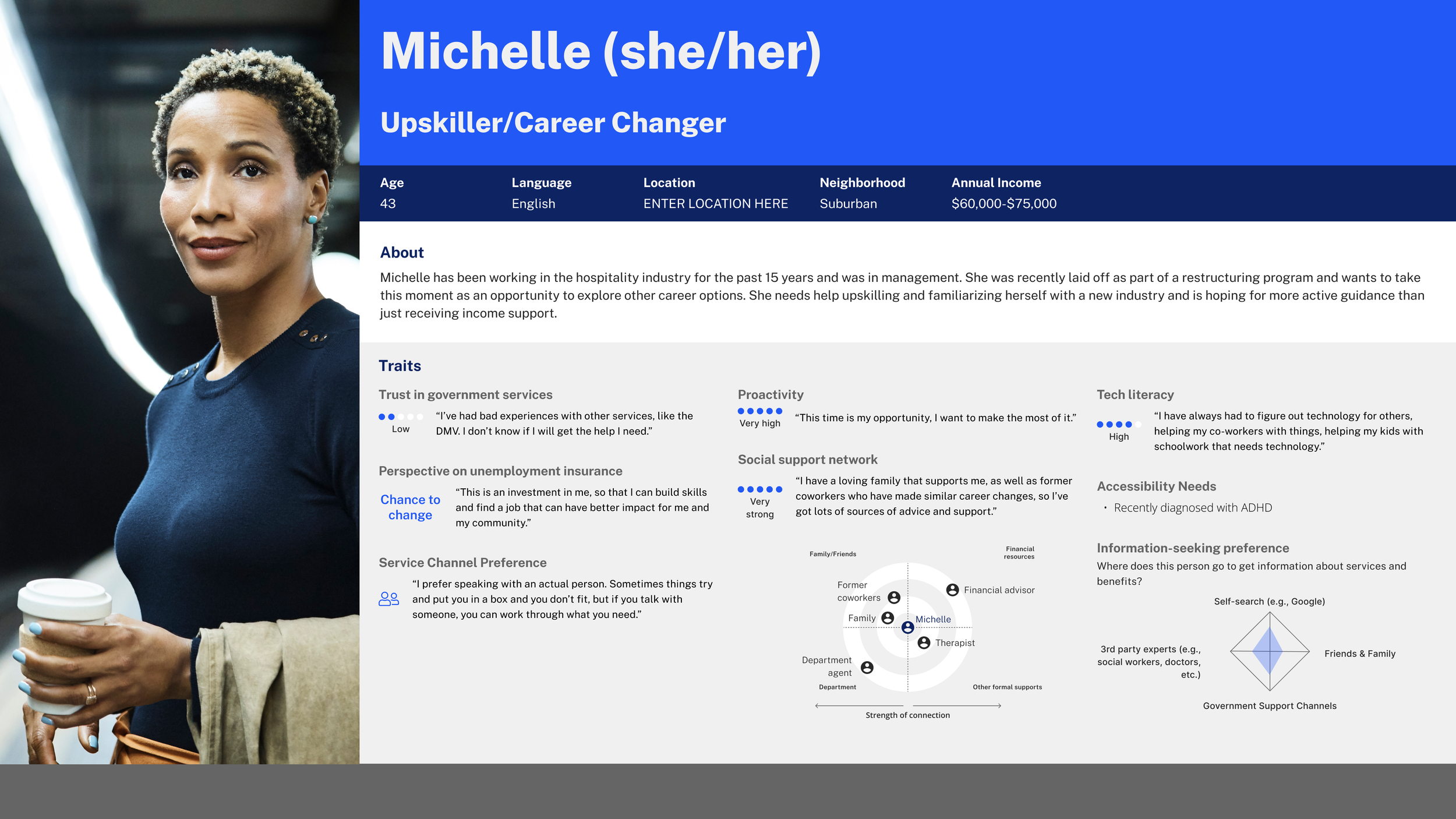
ii) Future-state service design: I led my team to run a quantitative survey with 1000+ respondents and qualitative 1:1 interviews with 30+ citizens to define the key personas and pain points that their future-state experience should be solving for. The agency was completely new to design research and it was very impactful for them to see the tangible benefits of understanding the needs of the citizens they are serving
iii) Systems and Processes deep-dive: I worked closely with the Systems and Processes team to translate the front-end impact of service design into the back-end impact on the agency’s legacy technologies and vice versa. I translated the 44 customer sub-journeys from our design research into proposed solutions to optimize the agency’s back-end systems and work processes
The Service Blueprint
We used the service blueprint as a key output of the extensive quantitative and qualitative research we conducted. This was a powerful artifact for the agency as it provided a single comprehensive view into the extent to which UX and systems (data infrastructure) and work processes are intertwined.
It helped articulate 3 key insights from our research:
i) The biggest pain point for claimants was the legalese and jargon around the claims process. It’s hard for native speakers to decode bureaucratic language and even more so for non-native speakers and older folks
ii) Any changes to the front-end service experience has trickle down impacts on the back-end systems and vice versa. The main agency website is a hodge podge of micro-sites as they are using old technologies that can’t communicate with one another, creating a fragmented and confusing user experience
iii) There is a huge opportunity to streamline the current workflow of the agency’s staff simply by cutting down on the number of platforms they are using to complete different tasks. We helped the agency reduce the number of platforms from 12 to 6 by consolidating their tasks
We also used the service blueprint to help prioritize the agency’s roadmap starting with the verticals where we see the most number of pain points and thus, highest level of impact if we were to address the pain points. We prioritized 5 key outcomes: better customer experience, increased equity and access, enhanced work environment, optimized stewardship of agency resources, and established sustainability of agency transformation capability. The project led to a 20+ improvements in the service design and back-end systems that increase efficacy of the claims processes from a score of 2 of 5 to 3.3 of 5.
