
oBike: Disrupting Transport, Transforming Society
oBike: Disrupting Transport, Transforming Society
Date completed: 2017
Role: UX Lead
Key Individual Contributions: User research, UX strategy, Wireframes, Interactive Prototypes, Usability Tests
At a Glance
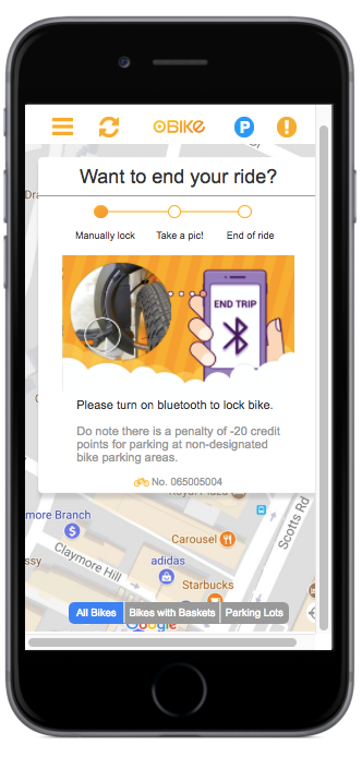
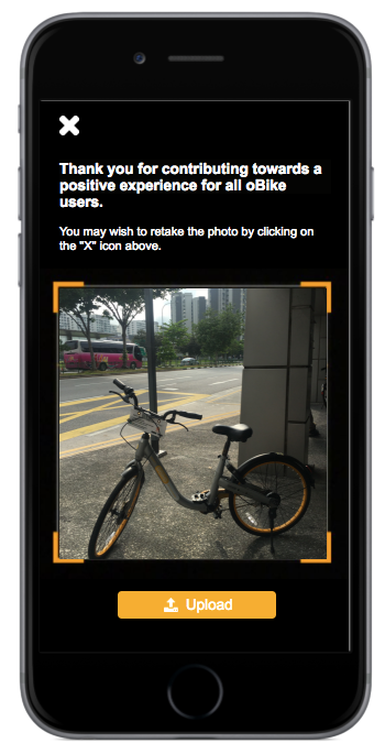
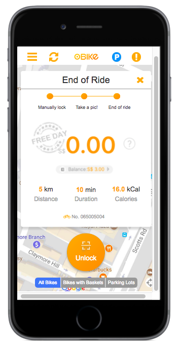
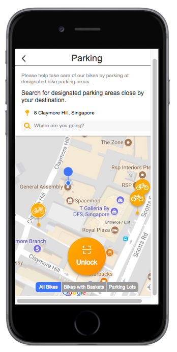
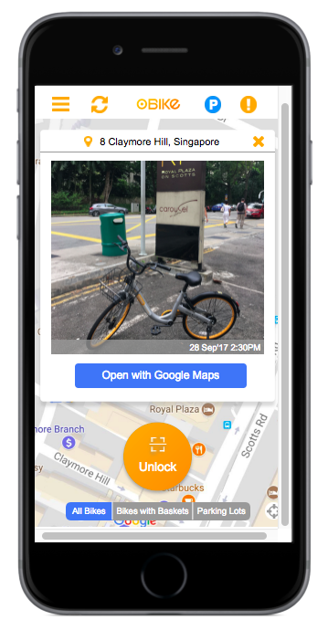
Going beyond a mere cosmetic redesign, we aimed at transforming societal bike-caring practices by intentionally building user responsibility and accountability as part of the userflow. In the past, users would end their trip by manually pulling a lever to lock their bike. As part of our redesign, users are now asked to take a picture of their parked bike’s location in order to end their trip. The reason behind this feature is two-fold - 1. Users will think twice about parking indiscriminately since they have to upload pictures before ending their rides; 2. The next user will have an easier time locating a bike as they would the option to view the bike’s last parked location.
Being a bike-sharing app, a user’s experience of the app is dependent on others’ bike-caring practices. To address users pain points, we needed an overhaul of the entire userflow.
The Context
oBike is Singapore’s first homegrown bike-sharing app. Launched in February 2017, it has borne the brunt of irresponsible bike-caring practices; costing the company up to $USD200,000 annually. Bikes are commonly seen destroyed; wheels taken off, handles twisted backwards, seats missing. On top of getting new users to adopt the app, oBike also faced an onerous task of encouraging existing users to take pride in the usage of the bikes.
The Research
Heuristics Analysis
We ran a competitive analysis of oBike and 3 of the other bike-sharing apps in Singapore against Jakob Nielsen’s 10 Usability Heuristics.
Key findings: As compared to its 3 competitors, oBike scored lowly Findability, Communicability, and Learnability. oBike used icons that were not intuitive i.e. an orange diamond icon representing membership. First-time users are required to spend much time learning the uses of the app, causing many to abandon the app.
Usability Testing
We conducted several rounds of usability tests. The first was on oBike’s current design, followed by a lo-fi and a hi-fi prototype tests of our redesign. Users were given a series of tasks and we measured time-taken to complete the same tasks on 3 designs.
Key findings: On oBike’s old design, users found the icons used to be confusing and the landing page to be very busy. Also, users struggled with finding important information buried in the Menu. First-time users also did not understand the animation illustrating bike-locking steps.
User interviews
We asked users to share their experiences with using the app – we wanted to understand what their key pain points and frustrations were, what they enjoyed about the app, and what they looked for in a bike-sharing app.
Key findings: Collectively, users lamented about the difficulties they’ve had in reserving a bike and then locating their reserved bike (very often the map was not accurate or bikes were parked amidst many other bikes and was hard to differentiate their reserved bike for the others). Users were also unaware of the new geo-fencing rules the government is implementing and that there were designated parking lots to begin with.
The Problem
Users struggled to find and locate a suitable bike for their needs.
We quickly realised we could not address their pain points without a larger transformation of the whole userflow. Since the oBike is a bike-sharing app, an individual’s experience of the app is dependent on others’ bike-caring practices. E.g. if a user parks his bike in a hidden location, the next user would then struggle in looking for that same bike the following day.
To address users’ pain points of the reserving, locating, and parking of a bike, we needed to incorporate bike-caring practices into our userflow.
Persona pain points
Current user flow; users faced peak point of frustration when locating/finding and parking a bike
The Ideation
Features prioritization chart we chose to focus on pre-commute, post-commute, and designated parking parts of a user
We launched into developing solutions for our users’ pain points. We then ranked the solutions into a features prioritization chart where we decided to focus on the pre-commute, post-commute, and designated parking features as they had high business and user impacts.
Meaningful insights:
We took these disparate feedback and comments and began our data sense-making process. We realised that users peak points of frustration were during the locating of a bike and parking of a bike. Since the oBike was a bike-sharing app, an individual’s experience of the app is dependent on others’ mindfulness/responsibility. If Jeremy dumps his bike at the end of his journey, Samantha would struggle looking for that same bike the following day.
We couldn’t simply address users’ pain points without an overhaul of the whole user journey.
The Prototypes and Iterations
Lo-fi prototype
We built a paper prototype to quickly test our redesign
Key findings: We created a list view for users to choose their designated parking area close by their destination. However, users did not find that useful. They preferred pin-drops to indicate parking areas. Users also wanted pictures of landmarks close by their designated parking areas.
Hi-fi prototypes
Taking users’ feedback into consideration, we then designed a hi-fi prototype to further improve on the lo-fi version.
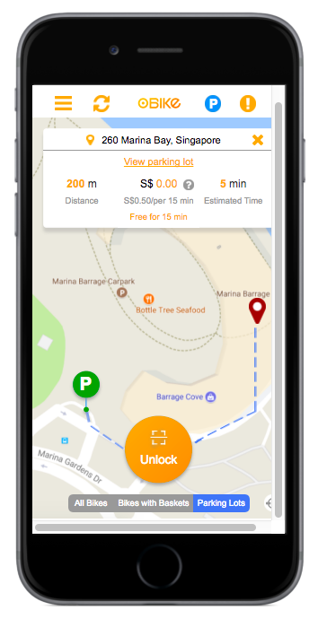
Key findings: We realized that it was not intuitive for users to “swipe-up” to view the different kinds of bikes. Further, users wanted a map to direct them to their designated parking area.
We incorporated these findings into our final hi-fi prototype (explained below).
The Solution
Solution in three-fold
We made it easier for users to locate, reserve and park their bikes via 3 strategies:
1. Build user accountability and responsibility into userflow
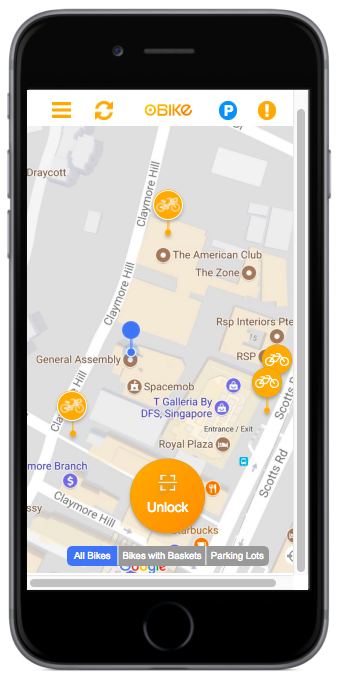
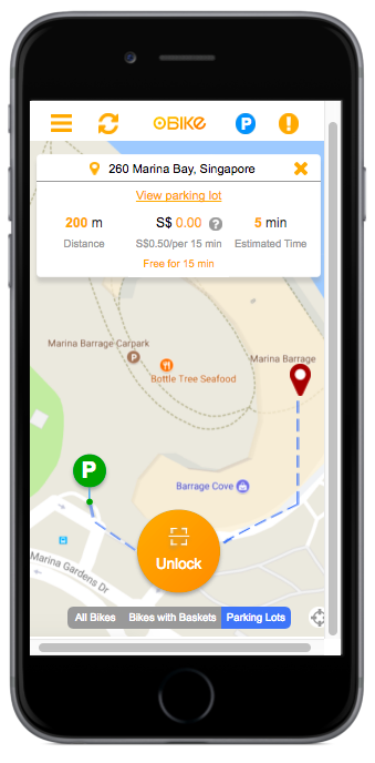
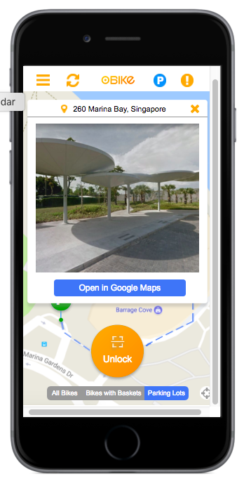
2. Include information on designated parking areas
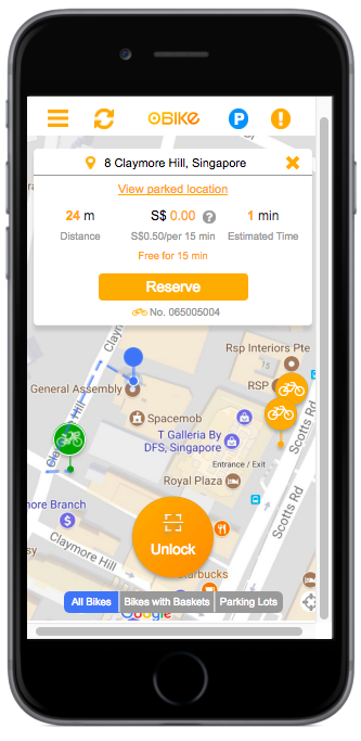
3. Provide more information on bike specs and location
1. Build user accountability and responsibility into userflow

2. Include information on designated parking areas
3. Provide more information on bike specs and location
Personal Takeaways
UX has a role to play in transforming societal behavior. More than just revamping the look of an app or website, it has an important role in redesigning the whole users’ experience of a product or service. As seen with oBike, our decision to incorporate picture-taking in the bike-locking process reinforced notions of communal accountability and responsibility.
We need to ask more of one another – It is easy to blame selfish bike-caring practices on individualistic ideals of a society; however, I believe we can do better. Throughout my interviews, users empathized with the wrecked-state of oBikes across the island and wanted to do their part in changing how we used and cared for common goods.